1) Duo App Login Screen (visible = new / rollover = old)
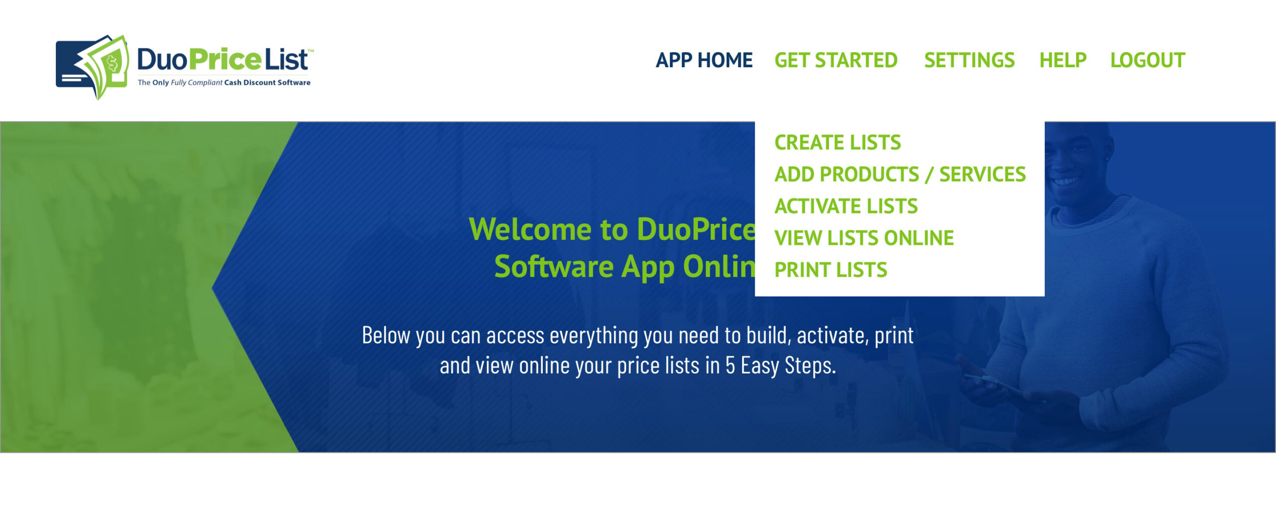

3) Duo App Price List Screen
3) UI Notes:
Here’s a link to view the whole page.
Note: all the “Get Started” pages have the same hero banner at the top, so that may be omitted on some of the screenshots for space.
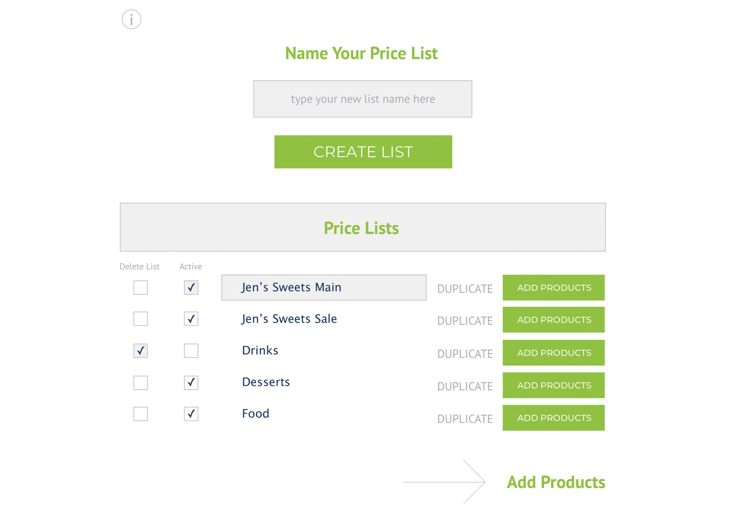
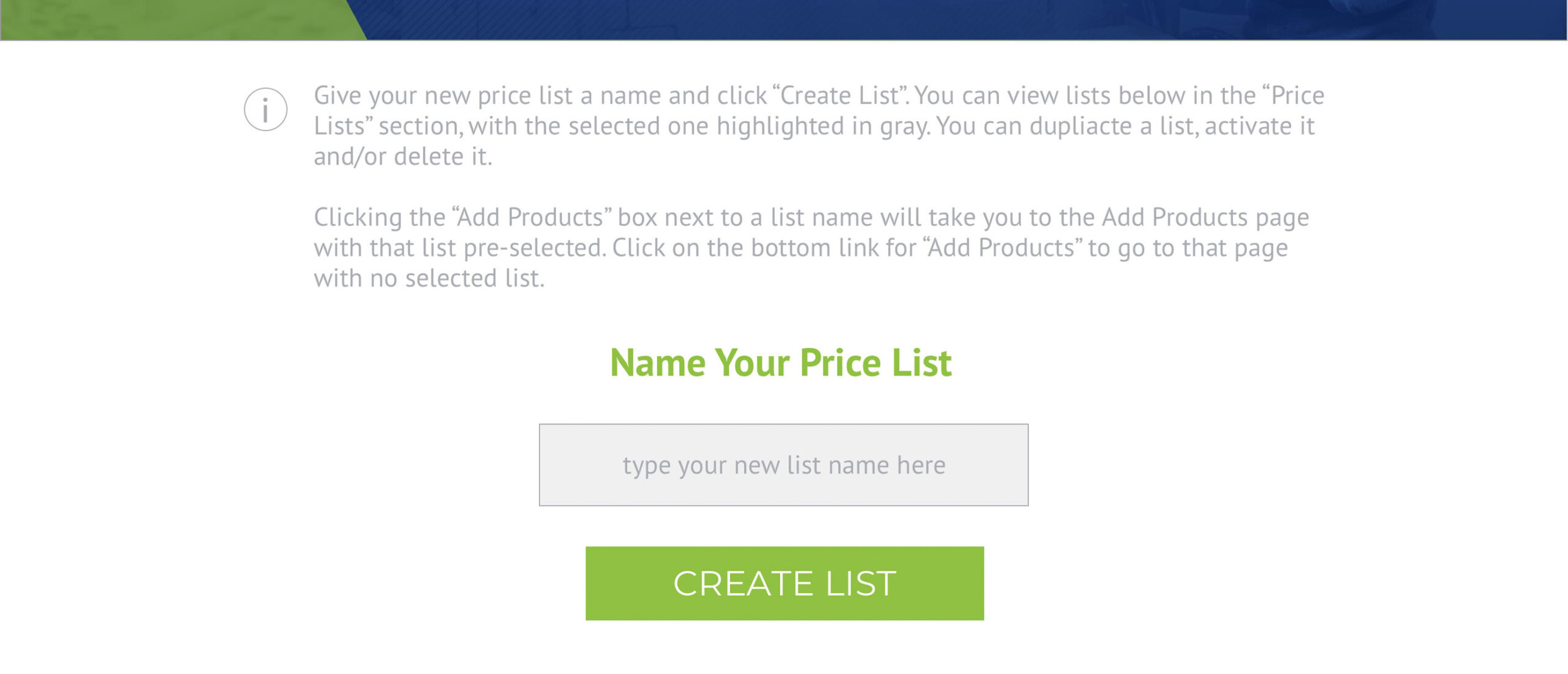
i. these are information tooltips at the top of each page with helpful instructions… let’s put these in an accordion row that stays out of site until a user clicks on the “i”.
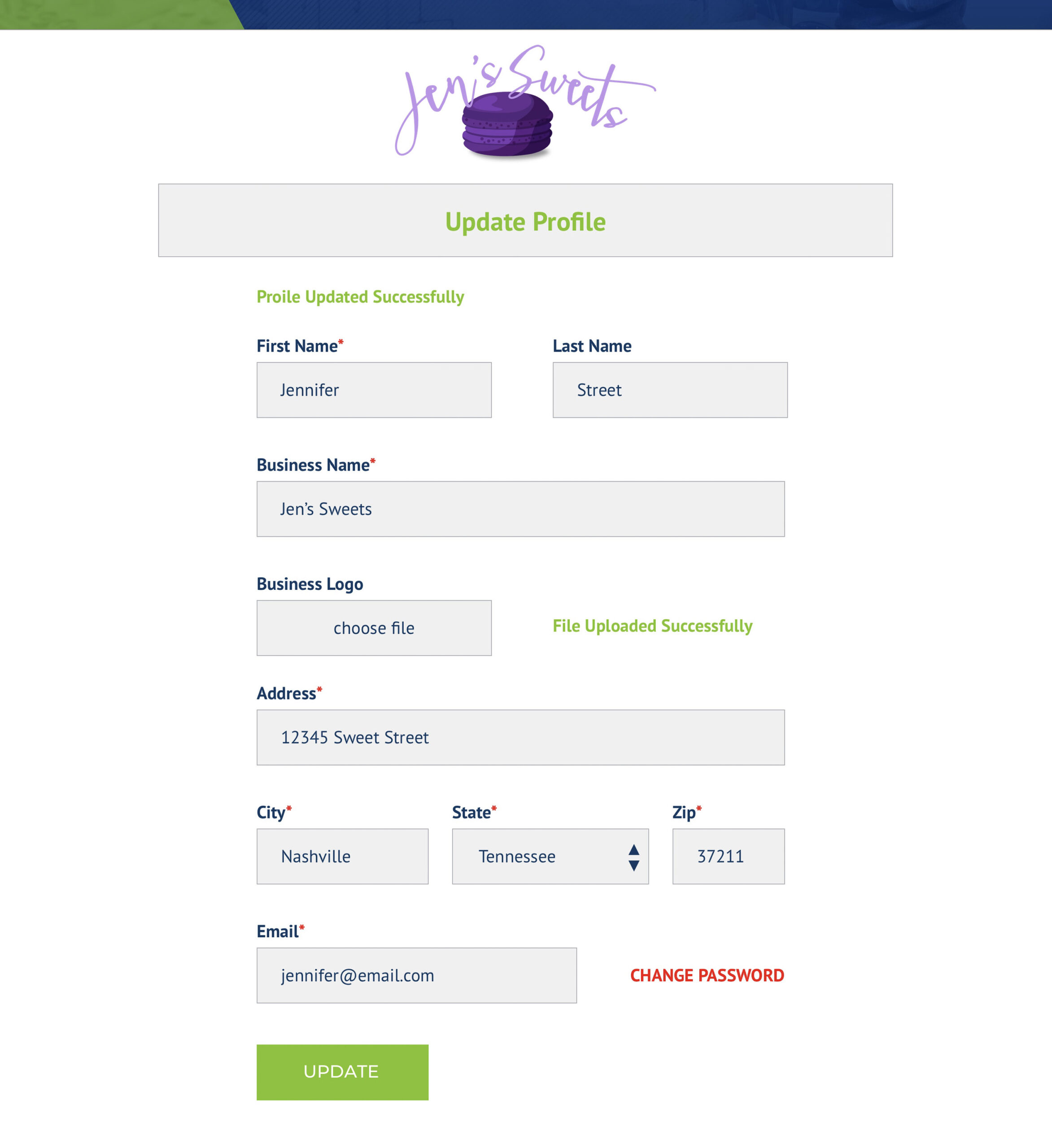
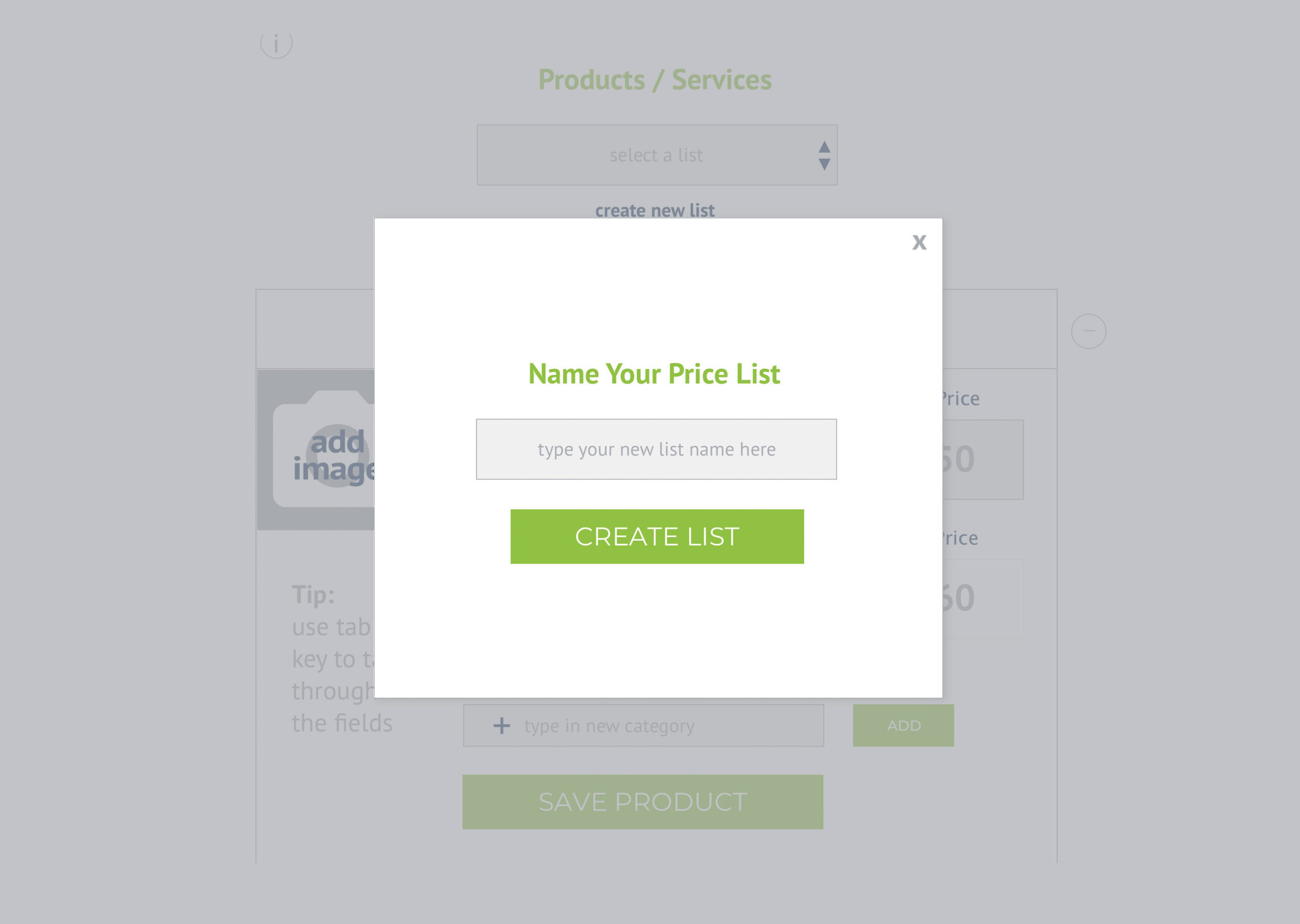
CREATE LIST – when a user types in a new list name and hits “CREATE LIST”, the Price List section refreshes to show the new list at the top (list order is shown by newest).
When then user clicks on a price list name, the field is highlighted to show that is active, and clicking the name makes it editable, if desired.
The DUPLICATE function allows users to duplicate a price list in its current state (renaming it with “copy” on the end). This means, if the list is yet unpopulated with products, it simply duplicates the list name and container. If the list has products already added, it duplicates the list name AND the products.
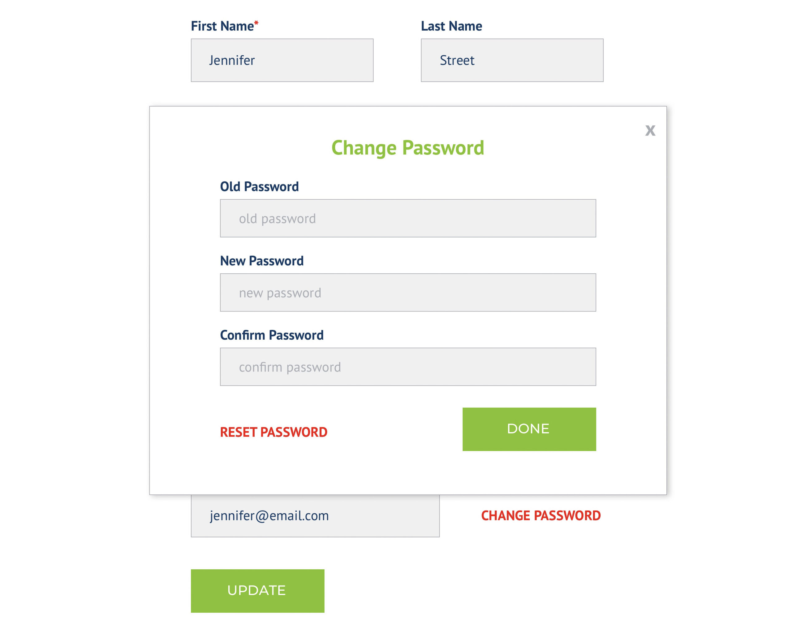
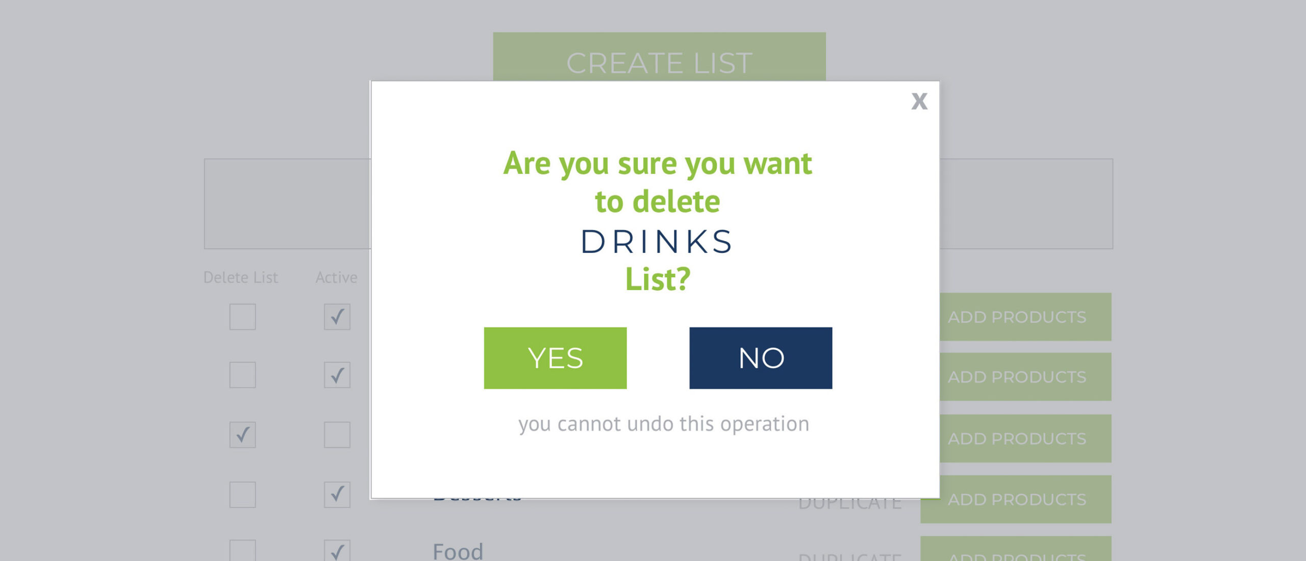
DELETE LIST – checking a box in the delete list next to a list will prompt a popup box to validate – “Are you sure you want to delete xyzzy list?” Yes / No
ACTIVE – Users can activate or deactivate a list from this screen as well as the next.
ADD PRODUCTS – Clicking the “ADD PRODUCTS” button next to a list will progress the user to the “Add Products” screen and have that list name preselected in the list selection drawdown field. Clicking the “Add Products” with arrow at the bottom of the page will progress to the next screen with no list preloaded.
4) Duo App Product Screen
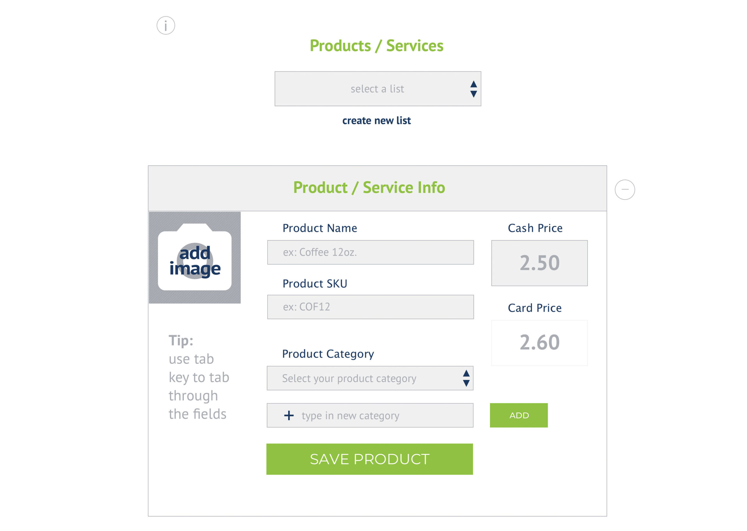

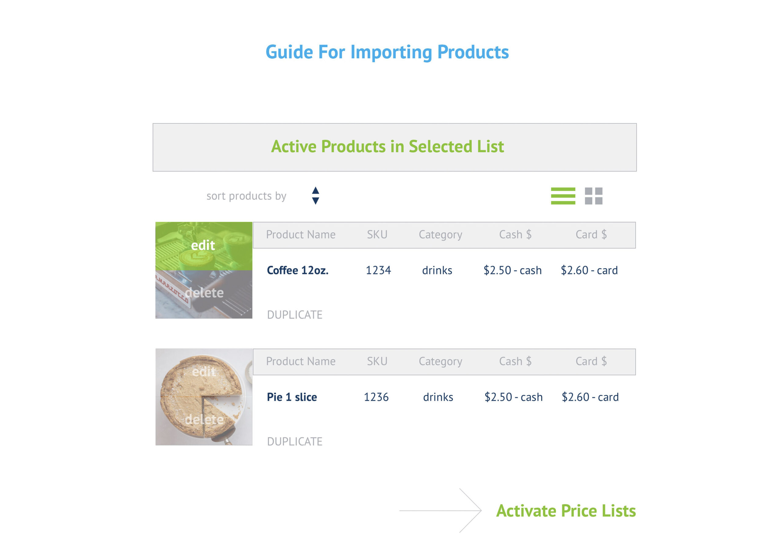
4) UI Notes:
Here’s a link to view the full page.
Note: Just to clarify, Section 4 is separated into different images because they are easier to view in a web page that way (for staging purposes)… but it’s all on the same screen for the real version.
i. Again, this is an info section that is in an accordion row (text is hidden until the circle i is hit).
CREATE NEW LIST – there’s a design mockup in this section that shows the “create new list” popup. Users can also create lists on this page in addition to the previous screen.
PRODUCT / SERVICE INFO – This is a container for users to key in new product info and upload an image. For the “Product Category” section, users can type in a new category and click the “ADD” button to add it and it will refresh the Product Category list. I didn’t crate a mock up, but a small popup that says “Product Category Added” with an “x” in the window to close it will be good.
Once users hit “Save Product”, their new product will appear in the “Active Products in Selected List” section, at the top… OR based on their selected sorting preference. Maybe it would be best to also add a small popup that says “Product Added”, same as the popup mentioned above.
The circle with the minus sign in it next to the “Product / Service Info” row gives users to collapse the box to only show the section header to clear space to better view the products below (so it’s an accordion row). This isn’t necessary but would be great to have.
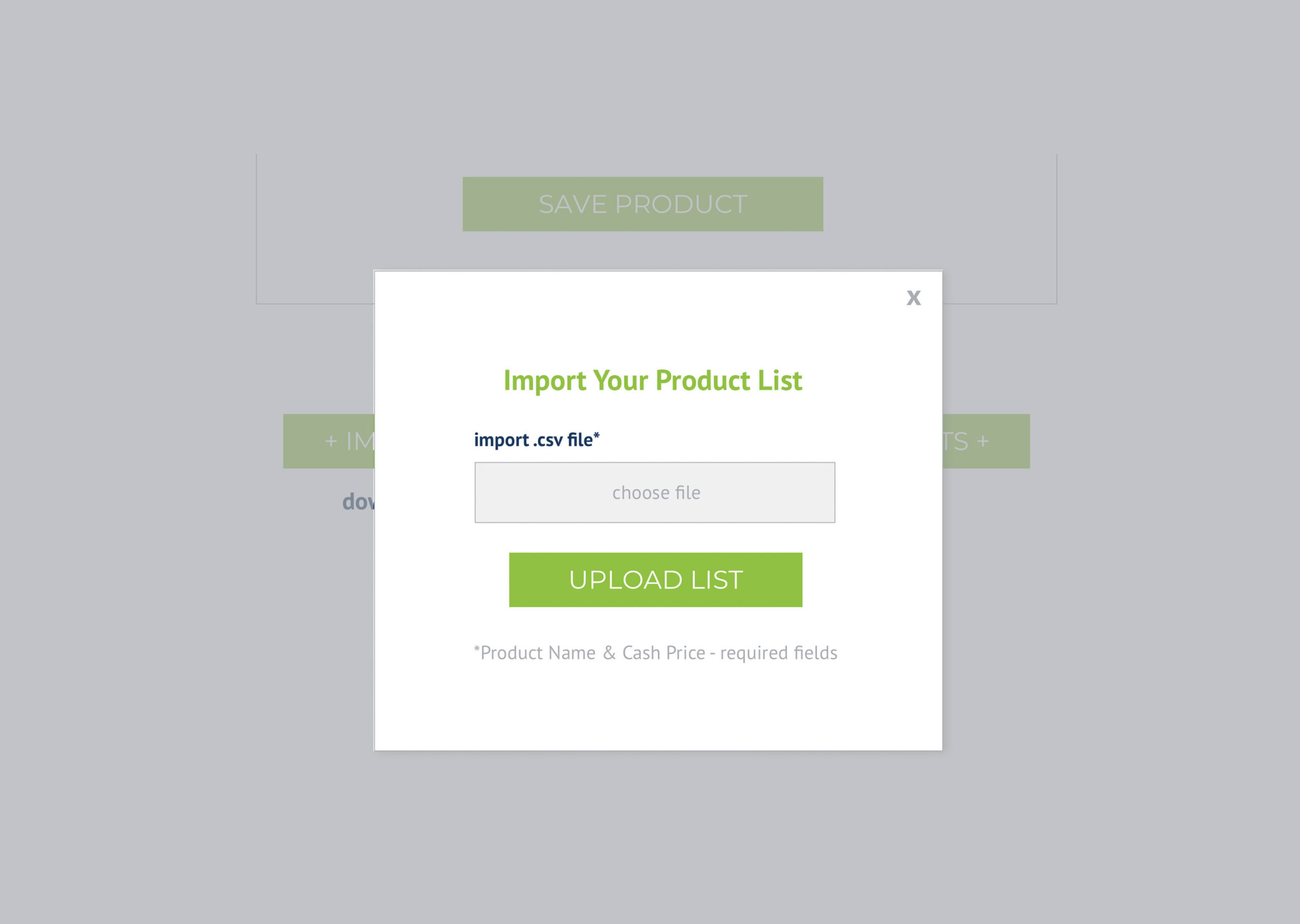
IMPORT PRODUCTS – I have not tested the upload list part of the app yet. I assume when someone uploads, if it’s not in the correct format, they will receive some kind of error? If so, just redesign according to that many other examples I’ve given for popups. If not we should add that. And if what they upload is the wrong format, we should include a link on that popup for them to download the .cvs template.
IMPORT PRODUCTS GUIDE – I’ll be creating a quick guide sheet of best practices and tips for them in preparing to upload products. (Maybe the link “Guide For Importing Products” should be above the Import / Export buttons, instead of below).
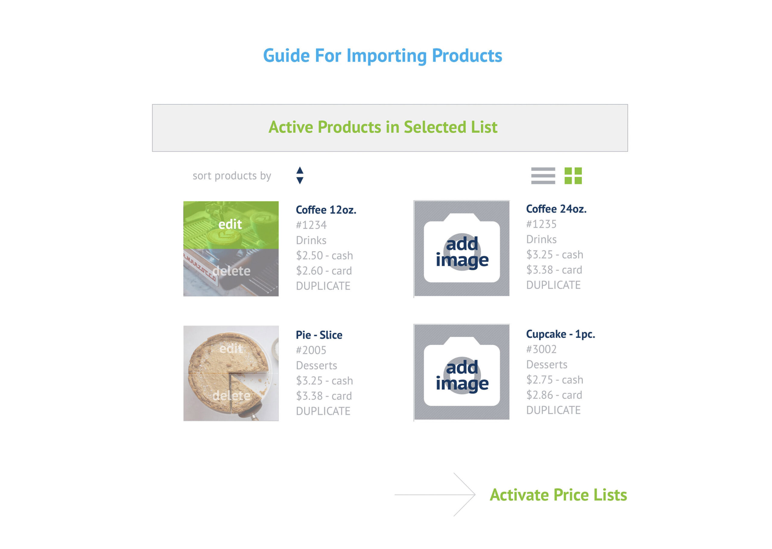
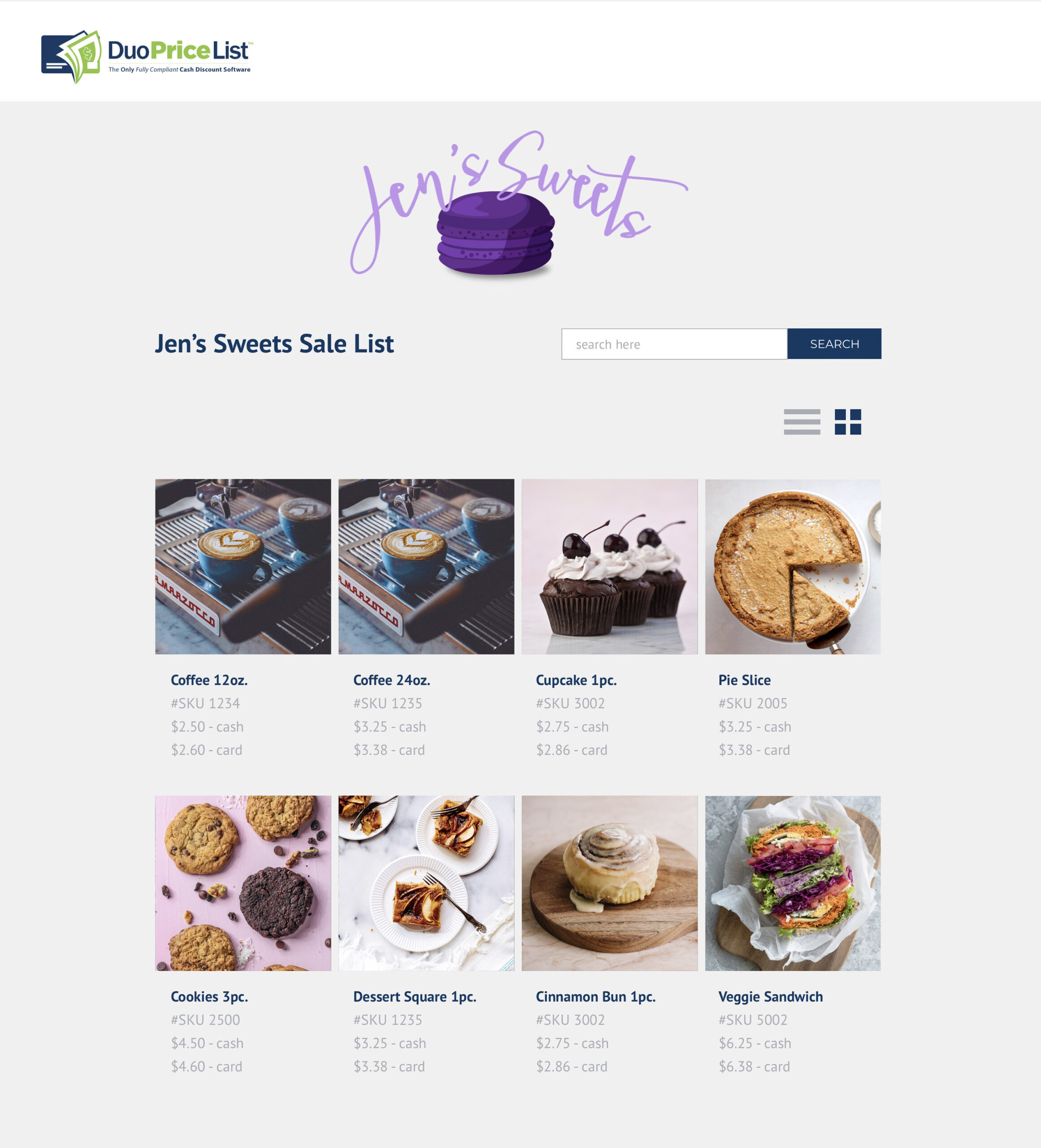
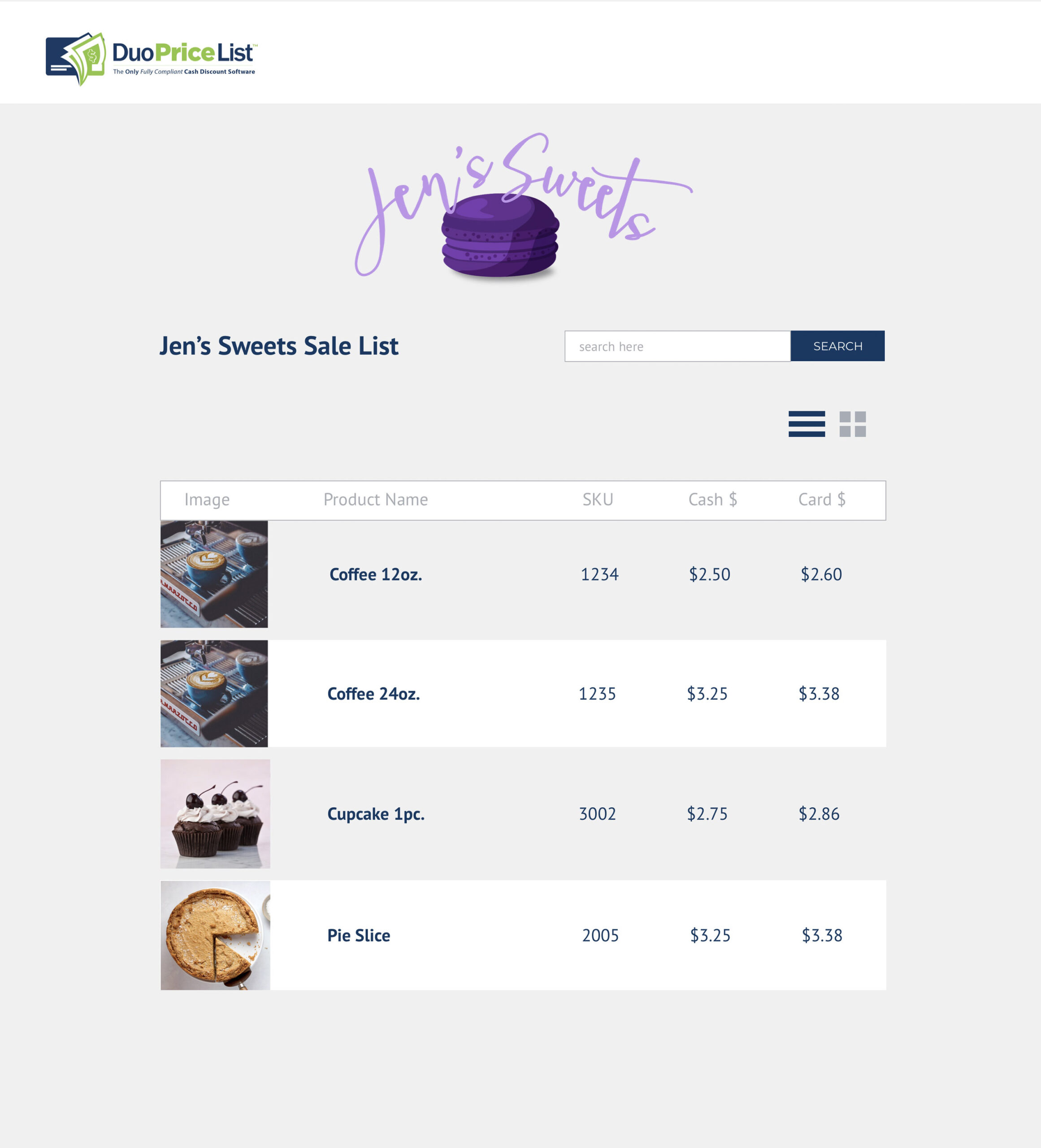
ACTIVE PRODUCTS IN SELECTED LIST – Users can view products in a thumbnail format (represented by the green square of 4 boxes) or by list view (represented by the 3 lines). A mockup for that view is at the bottom of Section 4. Users can sort their products by any field.
IMAGES – I have added semi-transparent overlays on top of the thumbnail image – one for “edit” and one for “delete”. Each one has a rollover color of that transparent green #7fc41c let’s say at 50% – 70% (whatever looks good). So when the user mouses over the “delete” overlay, it turns green, and vice versa for “edit”. If they click on “delete”, a popup window appears – “Are you sure you want to delete image? Yes/No” (use the delete list popup as an example). When they delete an image, the icon changes back to the “add image” icon.
PRODUCT SORTING – The order in which the products are sorted in is carried over to the activation and output sections of the app. So, if a user has sorted products by SKU#, then when they download, print or view their list, products will be sorted in this order.
5) Duo App Activate Screen
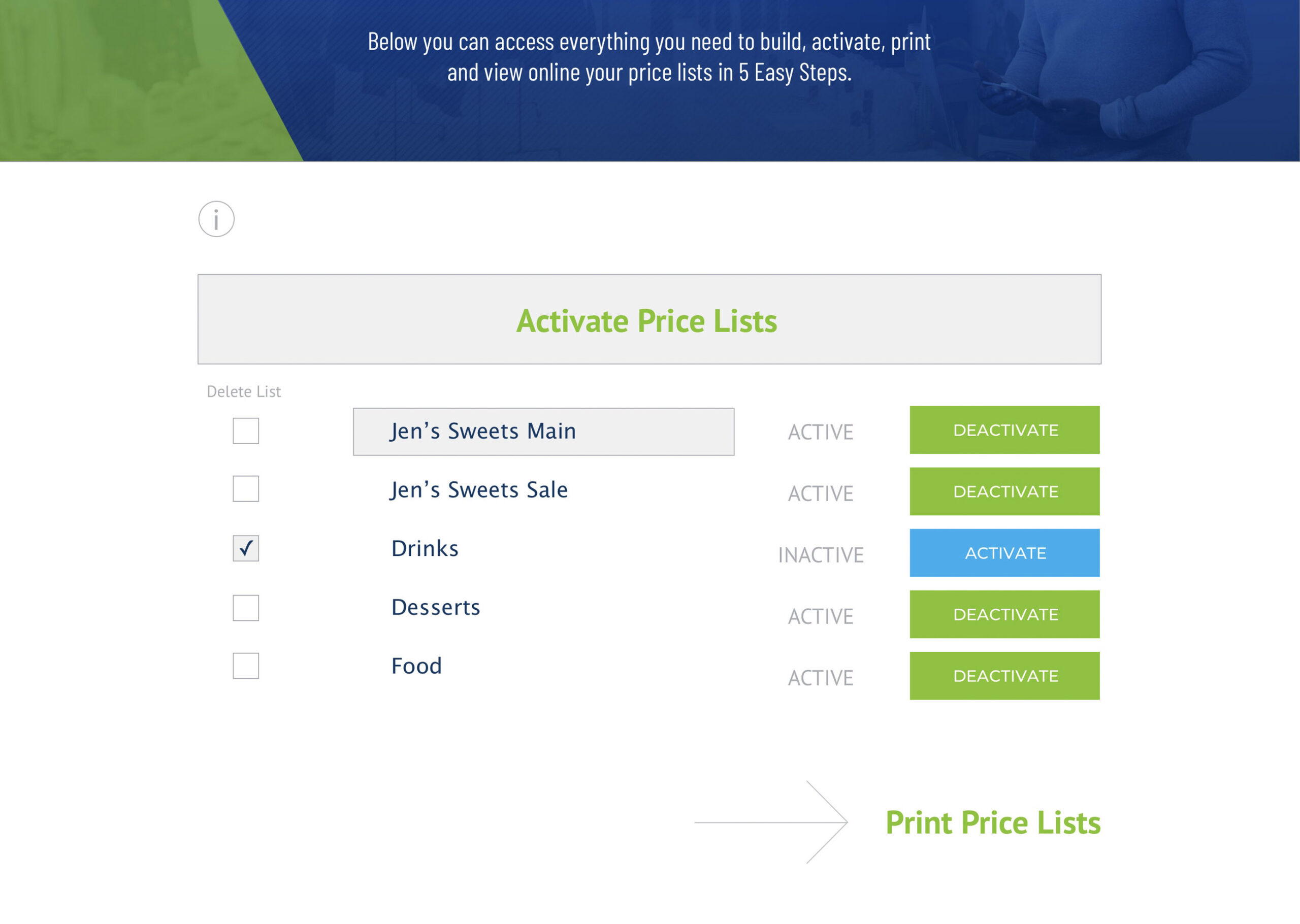
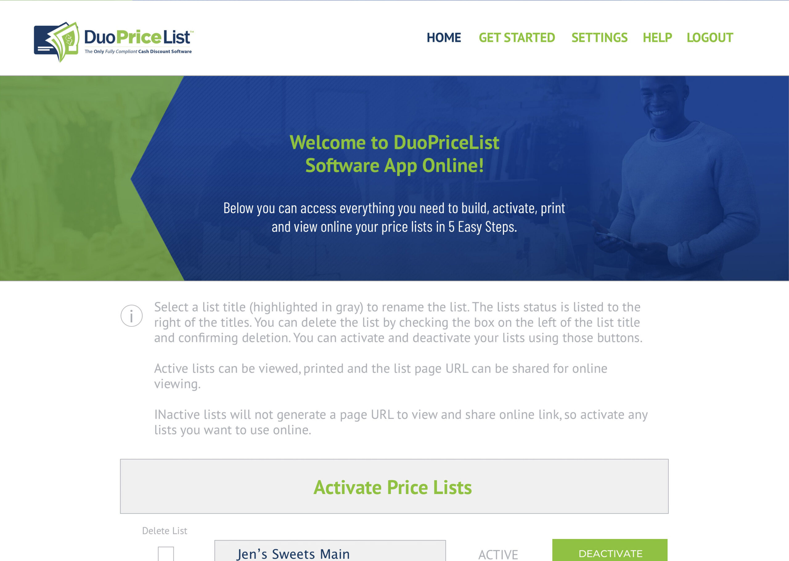
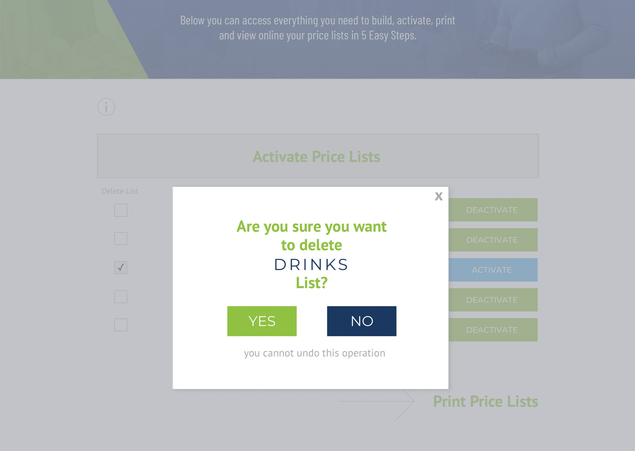
5) UI Notes:
Here’s a link to view the whole page.
i text:
Select a list title (highlighted in gray) to rename the list. The lists status is listed to the right of the titles. You can delete the list by checking the box on the left of the list title and confirming deletion. You can activate and deactivate your lists using those buttons.
Active lists can be viewed, printed and the list page URL can be shared for online viewing.
Inactive lists will not generate a page URL to view and share online link, so activate any lists you want to use online.
Pretty straightforward. Users can delete a list… active list is highlighted in gray… next to list name displays the lists status – ACTIVE or INACTIVE…. DEACTIVATE buttons in green… ACTIVATE buttons in blue.
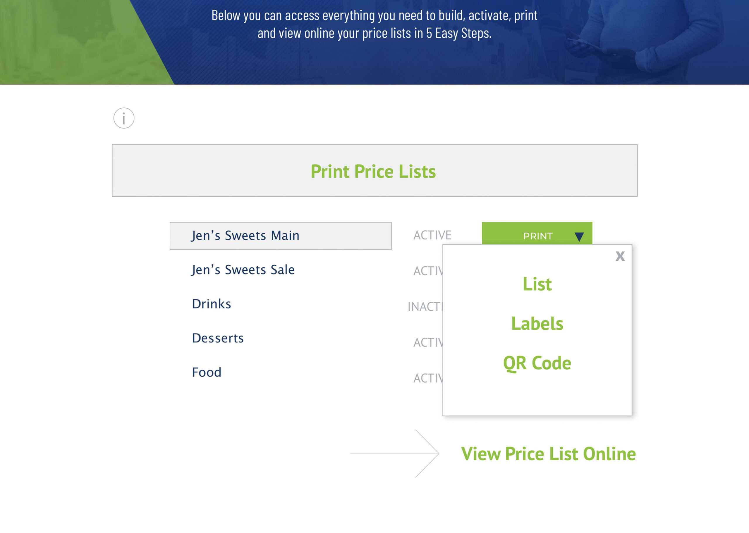
6) Duo App Print Screen
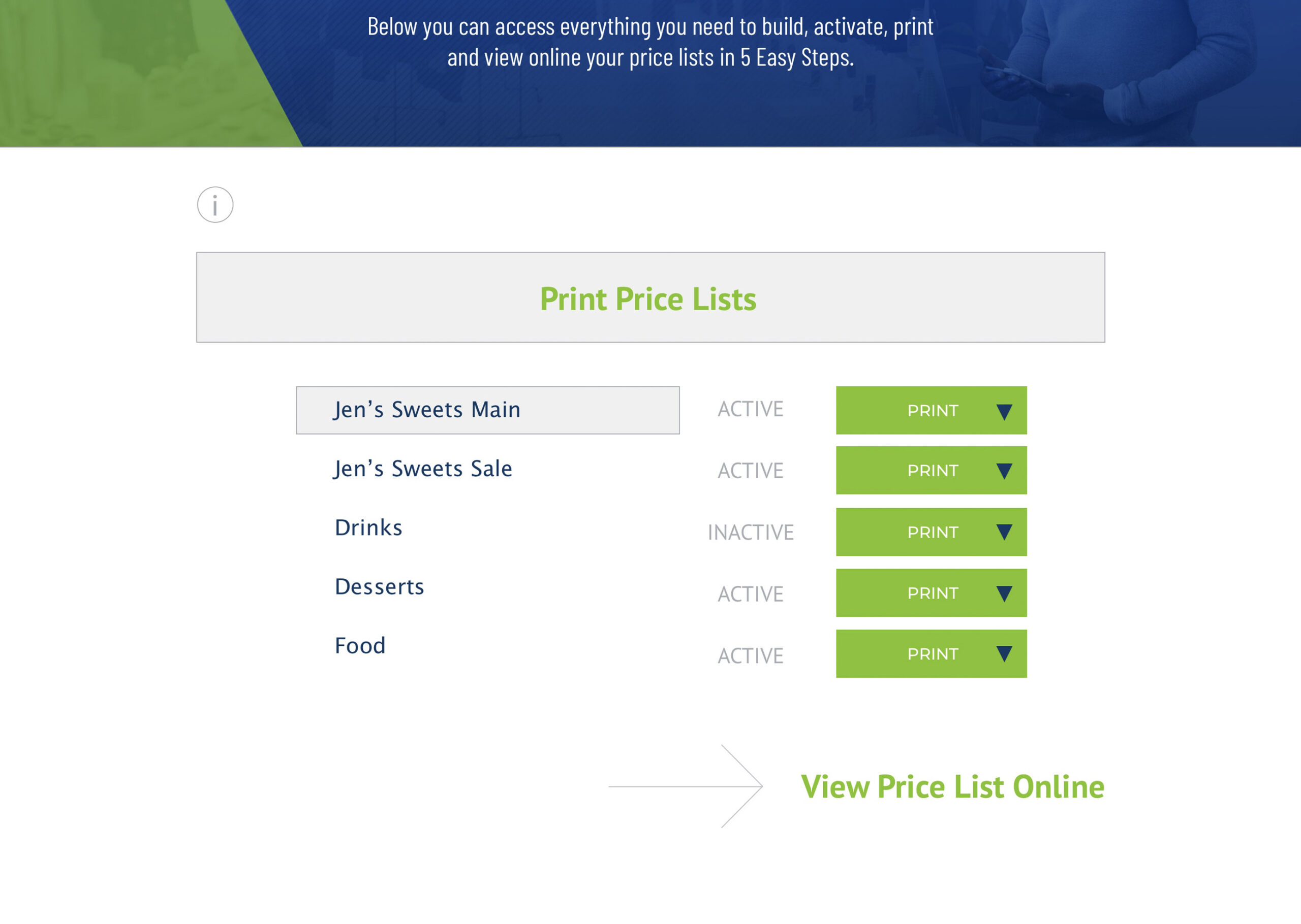
6) UI Notes:
i text:
You may want to print off your lists and keep them on hand for any customers who wish to see them or as a reference sheet for your store / organization.
Print List – this option allows you to view and download a PDF file of your selected list to save and/or print from your local computer.
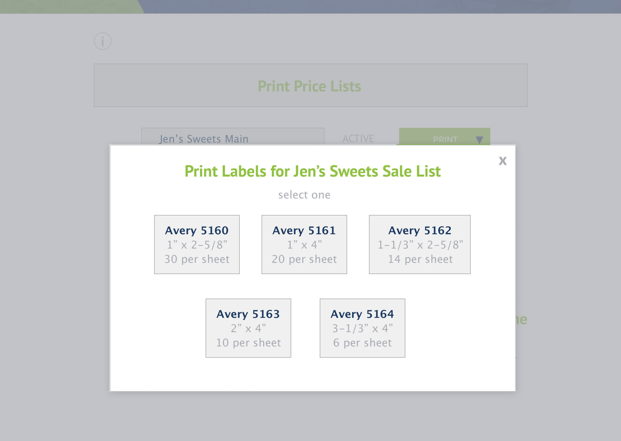
Print Labels – this option allows you to view and download a PDF file of your selected list within an Avery labels template, to save and/or print from your local computer.
Print QR Code – this option allows you to view and download a PDF file of a QR Code which contains a quicklink to your list online, to download, print and display at various locations within your store. QR codes can be easily read by any smartphone, using the camera app, by simply placing the QR code within the viewer for the app. It will trigger a message for the user to click and launch a browser window with your list online.
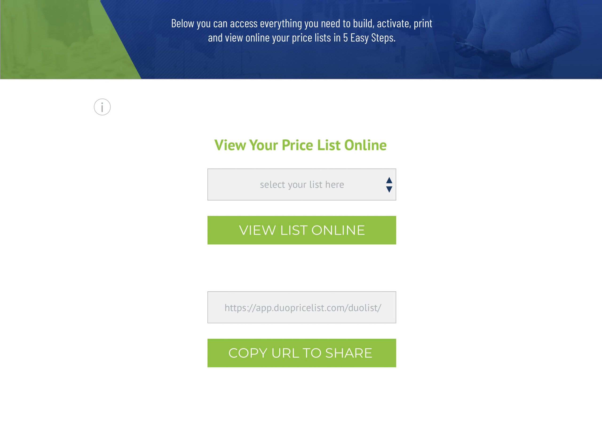
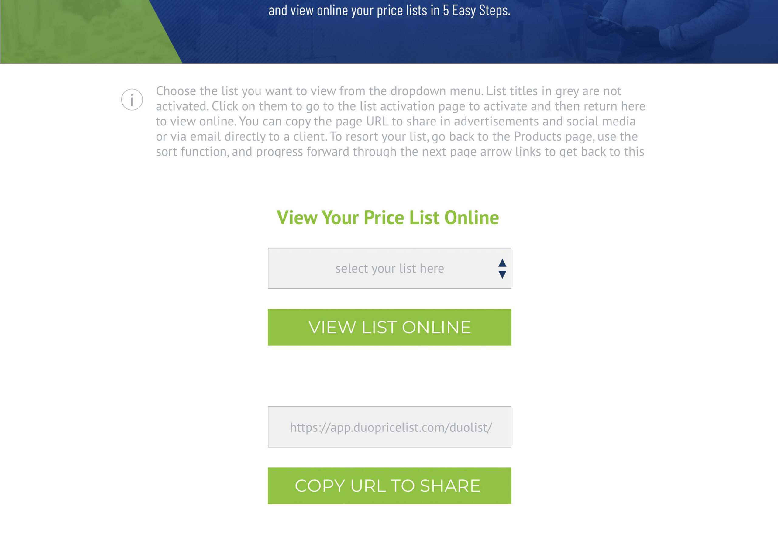
7) Duo App View Online Screen
7) UI Notes:
i text:
Choose the list you want to view from the dropdown menu. List titles in grey are not activated. Click on them to go to the list activation page to activate and then return here to view online. You can copy the page URL to share in advertisements and social media or via email directly to a client. To resort your list, go back to the Products page, use the sort function, and progress forward through the next page arrow links to get back to this page.
I’d like to have the customer’s logo at the top of the page (if they don’t upload one, then use the H1 tag to put their Company Name in as text). So obviously, we’ll need to go back and add in the “add logo” section to the beginning fo the process somehow. Let’s get through these changes and take a look. Maybe having their logo on every page would be great (instead of the welcome text that is currently in the header on your version of the app).
8) Duo App Print Sign Menu
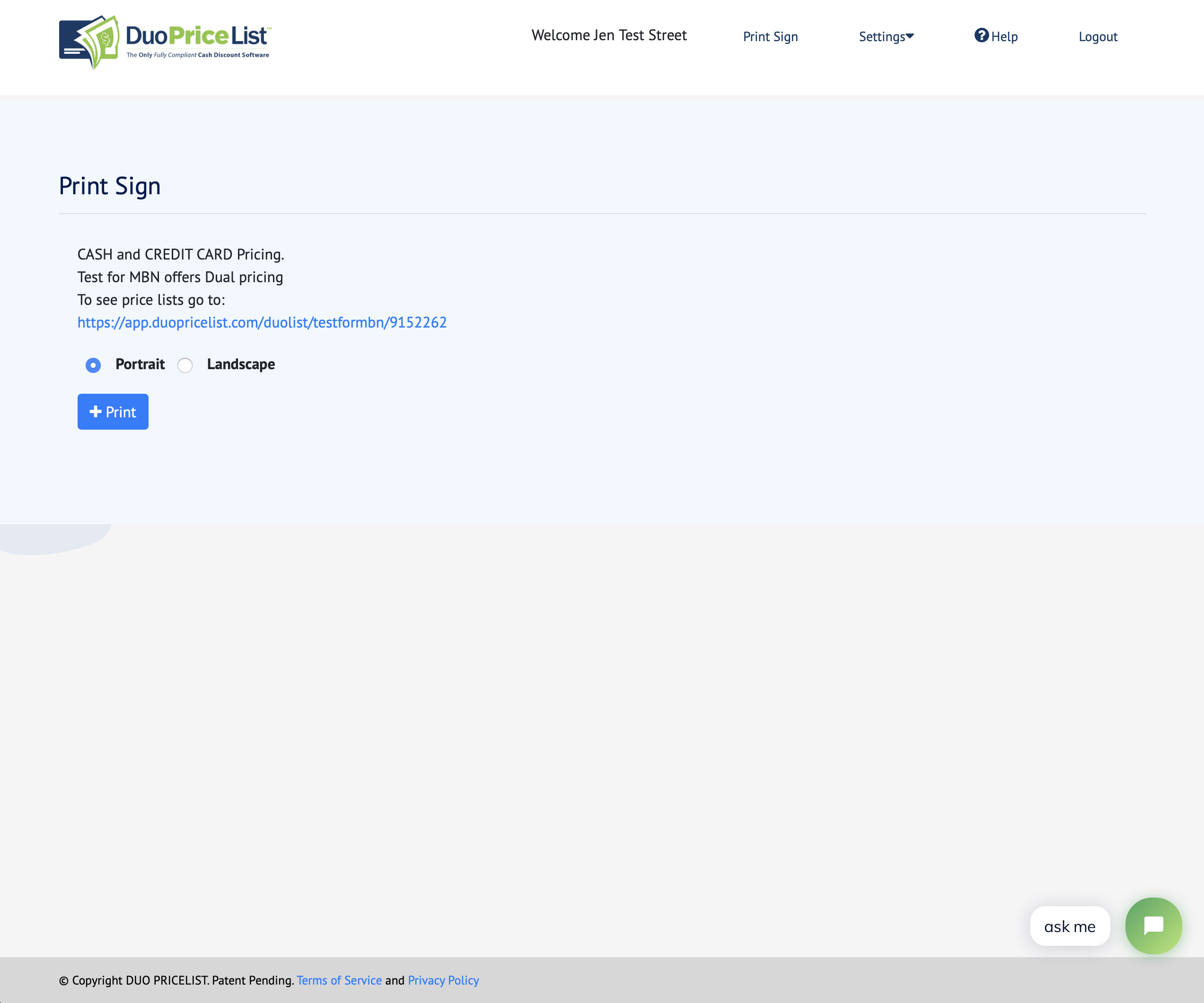
8) UI Notes:
I don’t think this page is even necessary. This option is already in the print section. If you want to add in an option for portrait or landscape view in the regular print list area, go for it.
There’s nothing on this page that’s not on the other, except for that (page orientation).
9) Duo App Settings Menu